Today we gave a lightning talk at Open Legislative Data Camp in Paris about the subject of interface design for open data websites. Here is a detailed write-up of our major points.
Interface?
An interface is whatever entity that sits between you and what you want (data, information, completion of a task, etc).
A good analogy is to think of your local tax office, which you have to visit sometimes to take care of various kinds of business. Your goal is to get that business taken care of, and you have to deal with an interface made of various desks, forms and clerks in order to get what you want.
When a certain task, such as filing your taxes, is an obligation, you'll be more willing to go through and overcome the interface. If, instead of taxes, the task would be to donate money to charity, and if you had to go through all those hoops in order to do it, it's easy to imagine that no one, or very few, would end up donating their money to charity.
An interface is seldom neutral: it can be a great tool to empower you, providing the pathways for you to reach all you need, or it can be a means to restrict and condition your actions.
In order to make sense of this, we informally came up with the term dissuasive interfaces – such as EULA's or most poorly-designed government websites – which will not encourage you to navigate the information within and, in more serious cases, actually drive you away, whether intentionally or not.
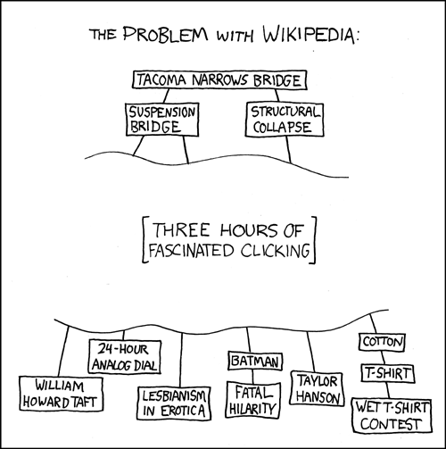
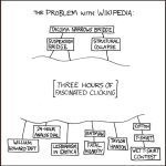
On the other hand, persuasive interfaces are about giving you a straightforward path towards what you want – but also provide you with things you didn't know you wanted in the first place. The best example we could find is how Wikipedia manages to accomplish exactly this:
Xkcd: The Problem with Wikipedia
When we consider open parliamentary data, it's definitely a field where we want to motivate users – government and parliamentary websites don't usually do a great job at this. So, learning from our experience building Demo.cratica, we began trying to answer the question of how can we come up with more persuasiveness in open government and parliament data websites? Here are a few hints on what might work towards this goal.
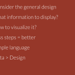
Care about typography, layout and general design principles
Not all of us are specialist designers, but the huge majority of us makes many more design decisions than we might think. A great way to realize this is to question the default choices: why use black text on a white background? Why this default font and not another one? Why should the link text be blue and underlined? Going along with the default is a design decision in itself, and it will have an effect in the way an interface is perceived.
You have a huge amount of colours, typefaces and layout choices to decide on – try spending a bit of time exploring other possibilities. For instance, a blog with a custom Wordpress theme will look much more determined than another which uses the default theme.
Think before you display
Once you have a well-built database with dozens of different fields, it is tempting to go all the way and display all the information you can – after all, you had so much work, you need to make it all visible!
Sadly, too much information can be worse than no information at all. A good rule would be avoid reflecting the internal data structure in the front-end. If you have 20 different fields of information for a single entity, think about the priority and/or importance of each field, and reflect it visually through emphasis. For instance, on a page about a specific person, that person's name and picture should be well visible, their birth date can be pushed to a less prominent “Details” section, and the timestamp of the last time this person's info has been updated should be almost hidden in the bottom of the page, if at all present.
Tip: Keep things in one screen (no scrolling) if you can.
Think before you visualize
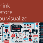
Infographics and charts bring with them a sense of credibility through numbers. And while these ways to display information have been soaring in popularity, we should be careful about what to focus on in our efforts to provide meaningful information.
Graphically pretty, but hard to read (hat-tip: Erick Schonfeld)
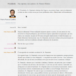
For instance, ranking politicians. In Portugal there was a Parliament monitoring site which ranked politicians based on the amount of bills they put forward. Assessing a politician's performance through a simple metric like how many bills they've proposed is not serious or even relevant, since parliamentary activity is not homogeneous or easy to reduce to cold numbers.
However, the media temptation to build a definite “Top 10” or “Hall of shame” list totally clashes with the goal of providing sensible and accurate perspectives on how parliament works.
It's a good question to ask if it is worth graphing or even displaying certain kinds of information, or if there aren't other, better ways to convey that information other than charts or graphs. It is too easy to skew or shape a story through gratuitous use of infographics. Avoid making them look what they aren't.
Reduce the number of steps
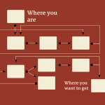
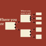
The heart of interface design is hiding complexity. Each additional step from home page to the desired bit of information will make a site a bit more dissuasive. A good interface provides simple paths to go through in order to get where we want.
Think what the most relevant and central parts of your site are, and center your site design around them; from there, it will be easy to fit the secondary sections in a non-obstrusive way. In Demo.cratica, we follow an informal “three-clicks rule”: all essential information should be accessible in no more than 3 clicks from the start page.
Eliminate specialist terminology
Going on with the goal of hiding complexity, one key part is to provide information in terms that your target audience can understand. In Portugal, we have terms such as “legislature” and “legislative session” which mean distinct things, but you have to know exactly what they are if you want to get to the Parliament transcripts in the official government website.
Each layer of complexity restricts access to a significant part of your audience; the best way to keep it accessible is to use common non-technical terms.
Design should be your last concern
It's too easy to focus and get lost in design details, losing sight from the greater goal of providing good tools to empower people with access to relevant information. Ideally, planning the back-end architecture and front-end design should be a simultaneous process, but not usually possible.
A good resource website using default themes – or no styling at all – is a much better starting point than a cleverly designed site with an incomplete backend or database (we made this mistake). The data needs to be ready at launch, whereas the design can be improved as you go.
These are just pointers into how design principles can be considered in the goal of providing an interface that works in catching regular users' interest. Front-end design can be a very strong tool in turning a simple data service into a relevant and attractive resource that can be used by audiences that you wouldn't even consider in the first place.
Update: Here are the slides.
 Manufactura Independente
