 Manufactura Independente
This article was originally published in Cuaderno Medialab
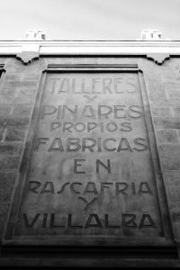
The future home of Medialab-Prado, Serrería Belga (Belgian Saw Mill), has its facades decorated with beautiful typography. Taking on the challenge set by Medialab-Prado to liberate these letters from their stone prison and release them to the world, we hosted a three day workshop in Madrid. The premise was to collaboratively design a font, using a fully libre workflow and with no pre-requisites for participation — everyone was invited to join in.
We were thrilled to receive this invitation from Medialab-Prado to come to Madrid and work together in a font revival inspired by a building with a rich historical background. The reception to the call was impressive and two days later we closed it having enlisted a total of thirty participants from different backgrounds and coming from different cities in Spain.
The first challenge we faced was to come up with a method that allowed collaboration to take place while, at the same time, creating and maintaining a cohesive design style. Having Serreria’s wall lettering as the starting point proved to be a very important aspect. It allowed us to have a reference point we could start from and go back to whenever we needed.
Looking at the building one of our first collective discoveries was that the wall letterings didn't came from a pre-existing font. In the compositions it is possible to identify different representations or variations over the same character. Still there are some principles behind the letter drawings that made it consistent in the overall.


The fact that the letterings were so rich and had so many shape variations made it the perfect stage for the work taking place. It allowed space for improvisation and interpretation (within a set of constraints). There wasn't one clear direction for the font design but many and we could pick from there freely.
The first day of the workshop went by without computer work. Pen and paper were our medium of choice in a phase we wanted as free and experimental as possible. The focus was to get the general feel of the font and not the perfect letter shape.
From the wall letterings we identified to possible directions and divided the large group of participants in two. We all moved to the first drafting sessions, where each person would draw a small set of letters. We would then gather and collectively look at the results, selecting one of them; then, we would go through another iteration of the process, this time with more letters, but sticking to the general rules that were set by the first drawing that was selected. Again, we all picked a satisfactory proposal among all of them, and the identity of the typeface was then set.

Now, the focus shifted from proposing alternative design directions to working together in order to draw all the characters based on the identity that we evolved in the previous steps. Using a manual version control system (with sticky notes), everyone was supposed to work together in order to draw the remaining characters from the alphabet, numbers, and basic punctuation. The rudimentary version control system helped understand the current status of our endeavour, as well as know who was working on what (replacing shouts) and know who to ask for pointers (e.g. someone drawing a B would want to discuss with whoever drew the P.).
From time to time we would stop, look at the progress and realign the general direction of the two typefaces taking shape. After a few hours of work, drawing, comparing and re-sketching, we ended the day with fairly complete character sets on paper.
On the second day it was time to turn our sketches digital, and for that we used the best vector graphics editor we know — Inkscape. After an introduction to vector drawing and a quick showcase of Inkscape’s powerful features, we set out to re-draw all the sketches using points and curves. The previous day drawings served as reference but we didn’t scan them. They served to understand the letter’s structure but were filled with inconsistencies we didn't want to reproduce in the digital drawing.

In regular intervals we would print the letters and get together to discuss them. Participants would propose changes, alternatives and sometimes would even decide on making multiple variations of a character. The environment was vibrant and lunch brakes became shorter with the will to get back to work and accomplish as much as possible. Extra characters were added to the initial set, some of them brought by participants suggestions. One of them was the “ñ”, a characters widely used in Spanish. Medialab-Prado’s technician contributed a beautiful @, extending the font glyph coverage beyond what was initially planned.
The last day workshop day was reserved for Fontforge, the font editing tool. It was when we began collecting all the glyphs and compiling them in the final file. But a font is not made only out of glyphs, it is also a collection of the relations between them. The spacing between characters is an important part of type design and can be a very time consuming one. In the field of libre fonts the task becomes easier as you can use resources from one font and apply them to yours. Having this in mind we went back for a script we wrote a year ago. It is called Transpacing and what is does is that it picks the spacing tables from a font and applies it to a different font. This made our work easier as we quickly borrowed the spacings of similar fonts and applied them to our own.
Once the fonts were finished we proceed to writing the copyright notices, appending the Open Font License, creating the FONTLOG and checking all appropriate boxes before exporting the final file. The font was released on Open Font Library, an online repository of libre fonts, and we all clicked the upload button together. From there anyone was free to pick up the work, building upon it or take it in a different direction.

The two fonts created were named Serreria, after the building that inspired them. Serrería Sobria was based in the most conservative letter shapes while Serrería Extravagante was based in more decorative shapes. We celebrate their release and ended the workshop making beautiful type specimens with them.
The fonts and documentation are available at
manufacturaindependente.com/piedranave.
Find Serrería
Sobria and
Serrería
Extravagante
the fonts at Open Font Library.
The photos in this posts are by kamatiko