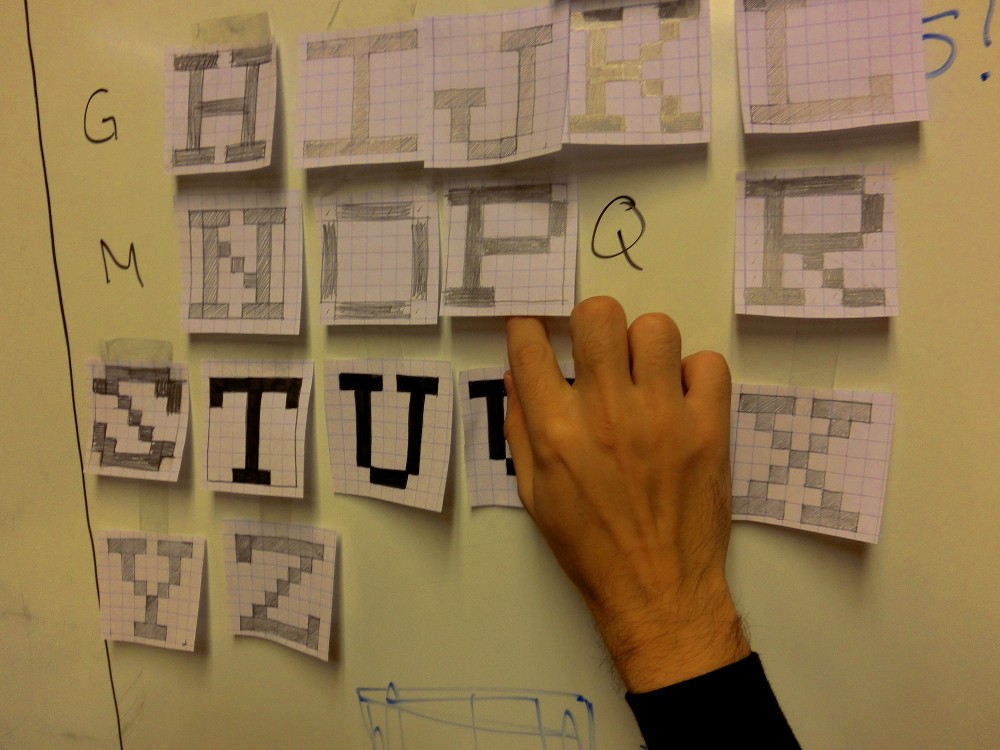
We were invited to participate in FCForum with a keynote and a type design workshop.
The fonts.txt workshop featured our usual double-purpose workshop approach: test a system that we've been working on, as well as producing concrete results that everyone can share and take home.
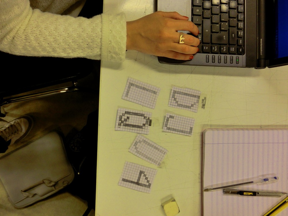
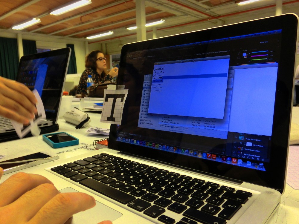
This time, our theme was plaintext: as part of our experiments in alternative interfaces for type design, our challenge would be to design bitmap fonts using simple text files. Reminiscent of ASCII art and the practice of drawing with text characters, our pipeline again used the Graphicore bitmap font library to convert the text files into OpenType fonts.
The workshop
Once again, we put our traditional font editor aside and propose a different kind of workflow.
The Graphicore Bitmap Font Format proposes a bitmap font representation that
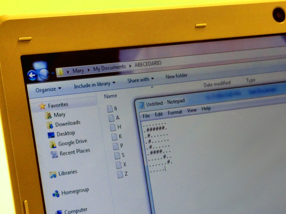
we particularly enjoy: each glyph is described in a separate .txt file,
containing a visual representation that brings us back to ASCII art.
For instance, here's an example of what you'd find in a text file that
describes a capital A:
...###...
..#...#..
..#...#..
..#####..
..#...#..
..#...#..
.###.###.
The visual nature of this font format makes it ideal for getting anyone up to speed with creating digital versions of bitmap typefaces. The fact that each glyph lives in a separate file makes it possible to have teams working on the same font.
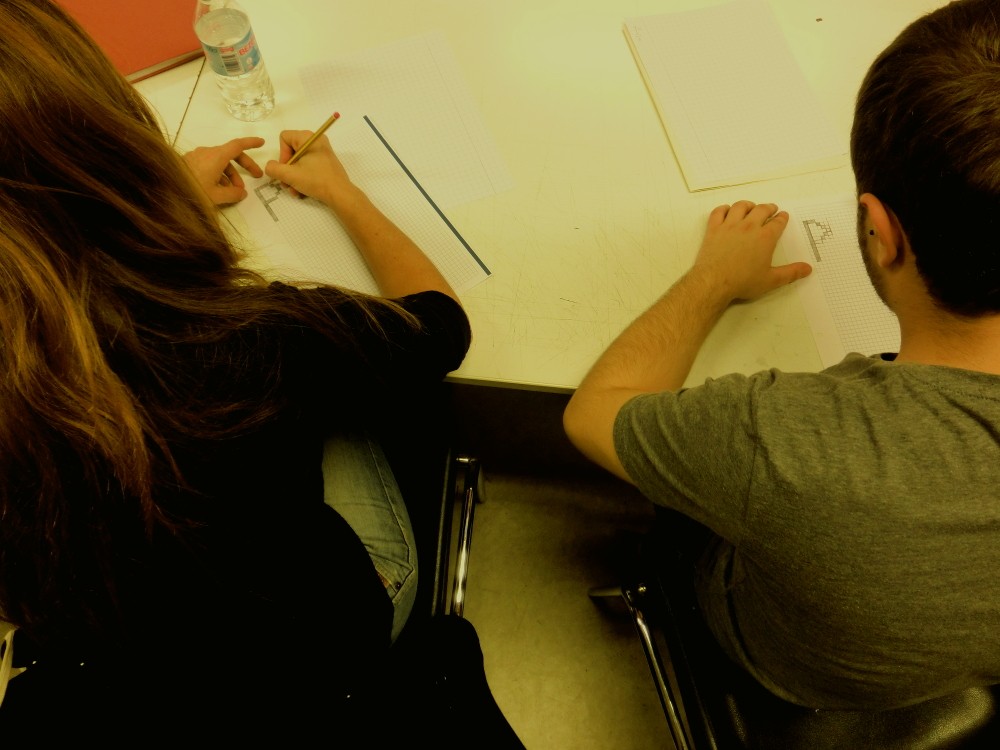
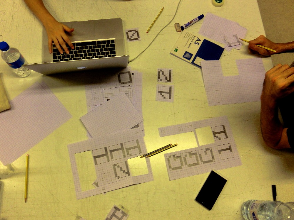
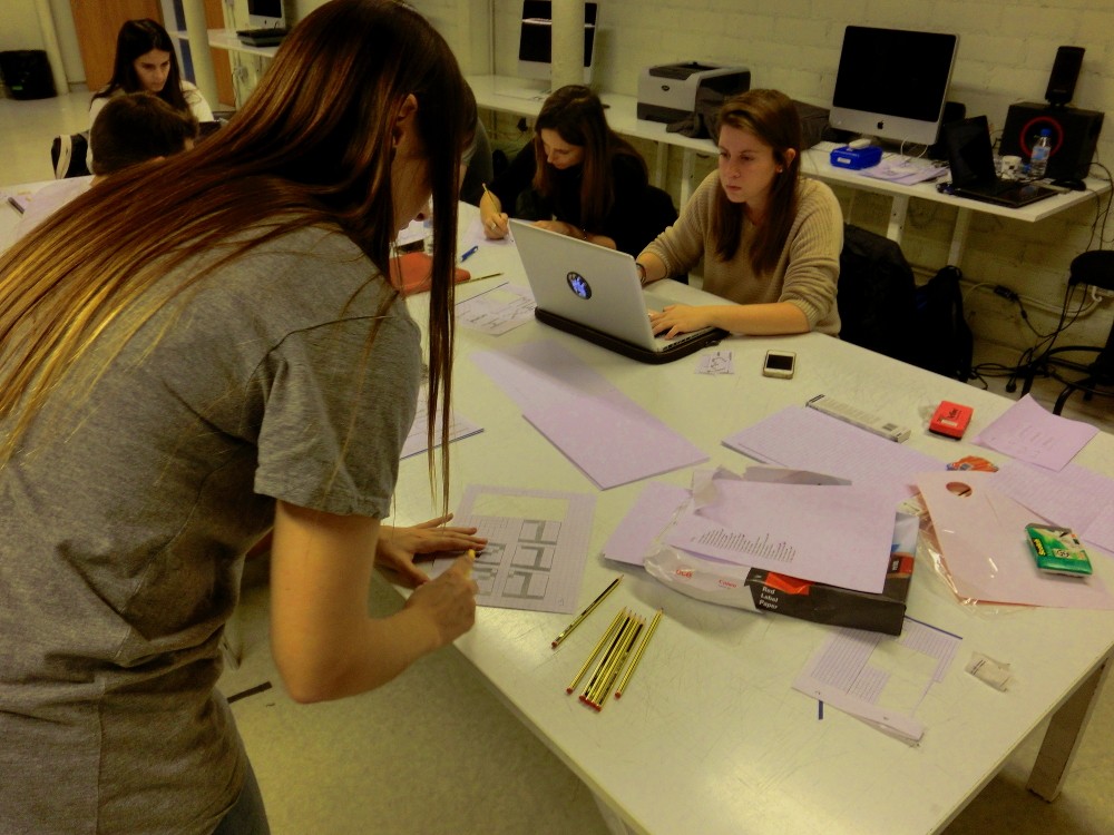
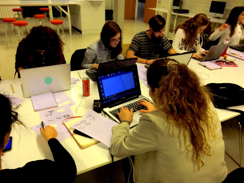
We had a full house with more than enough people to form 3 teams who could work on separate fonts. Each team was assigned a specific proportion for the typeface they'd design:
- Group A: a typeface taller than it is wide (condensed)
- Group B: a typeface wider than it is tall (extended)
- Group C: a typeface with the same width and height
From there, the teams moved to quickly iterate through possible designs and make fast decisions where to go next, with Ana and Ricardo serving as benevolent dictators whenever a complex decision needed to be taken -- otherwise there would be no way to end up with a finished typeface in 4 hours!
Stemming from the X11
fonts style of
naming fonts after their proportion (5x8 or 6x10), we decided on using a
Catalan transliteration from the proportions of each team's font:
- 6 by 12 = Sisperdotze
- 7 by 10 = Setperdeu
- 7 by 7 = Setperset
The outcomes
Work was fast and intense, and after some prodding and discussion each team delivered their text files, which we then eagerly fed our set our scripts in order to end up with TTF files. Our goal was to have at least the uppercase glyphs covered, and we were delighted that each team was able to tackle figures as well!
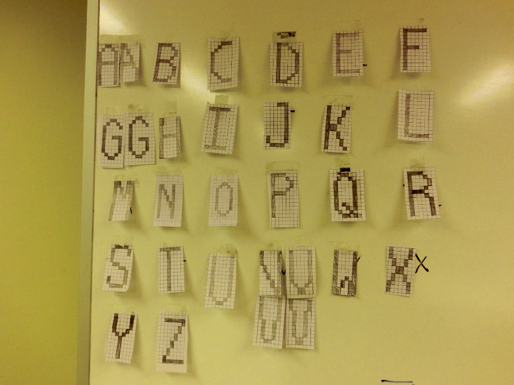
Sisperdotze is an elegant and thin sans-serif which stays close to the terminal font aesthetic
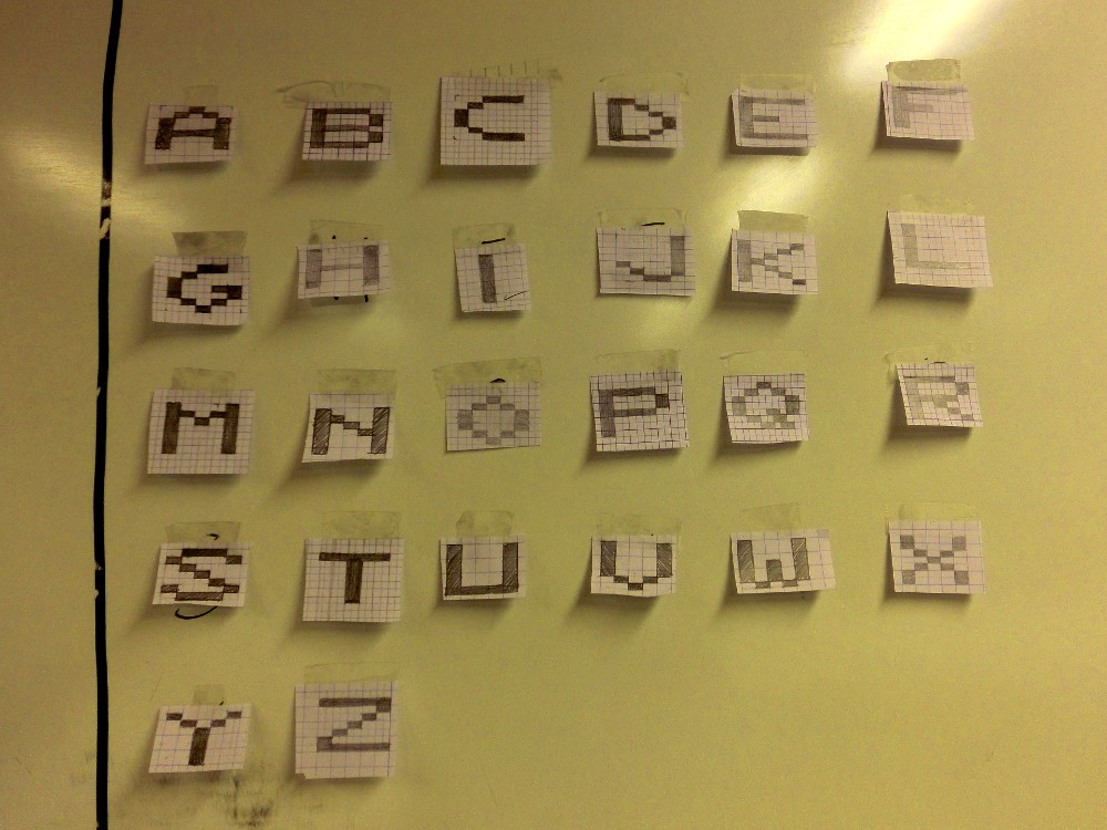
Deuperset has a blocky and (dare we say) retro look that brings us back to early Atari-type TV consoles.
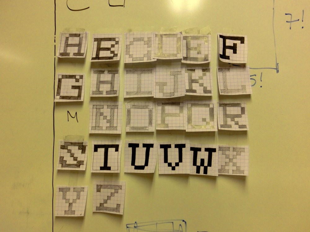
Setperset is a daring proposal to put forward a serif design which stands out from its play on a square frame.
After digitising these designs and passing them through our script pipeline, we now have beautiful outline versions that can be used in web sites or print layouts.
-
The quick brown fox jumps over the lazy dog
Sisperdotze by
-
The quick brown fox jumps over the lazy dog
Deuperset by
-
The quick brown fox jumps over the lazy dog
Setperset by
Now they're available at the Open Font Library, so check out, download, use and hack on them!
Acknowledgments
Image credits
- Carla Boserman
- Manufactura Independente
Workshop participants
Sisperdotze:
- Kira Riera Contijoch
- María Florencia Fernández
- Maria Luisa Jimenez
- Irene Farré Márquez
- Óscar Pereira
- Dario Trapasso
Deuperset:
- Aurora Alonso
- Alba Clemente
- Sílvia Fabra
- Nuría Fernández
- Maitane González
- Adrià Valls
Setperset:
- Nelson Dieguez
- Oriol Gayán
- Vanessa Pacheco
- Irene Serrano
Special thanks
- the FCForum team for organising an energetic and deep-reaching event, and for highlighting the "open design" ecosystem; our <3 to Jaron Rowan, Carla Boserman, Jara Rocha and everyone involved in organising and supporting this one-of-a-kind event.
- all the participants in the workshop, who did some excellent work in a particularly tight timeframe!
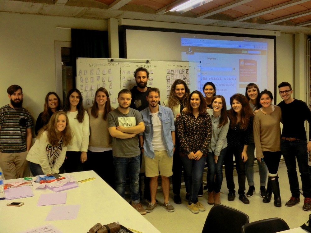
 Manufactura Independente